Chapters
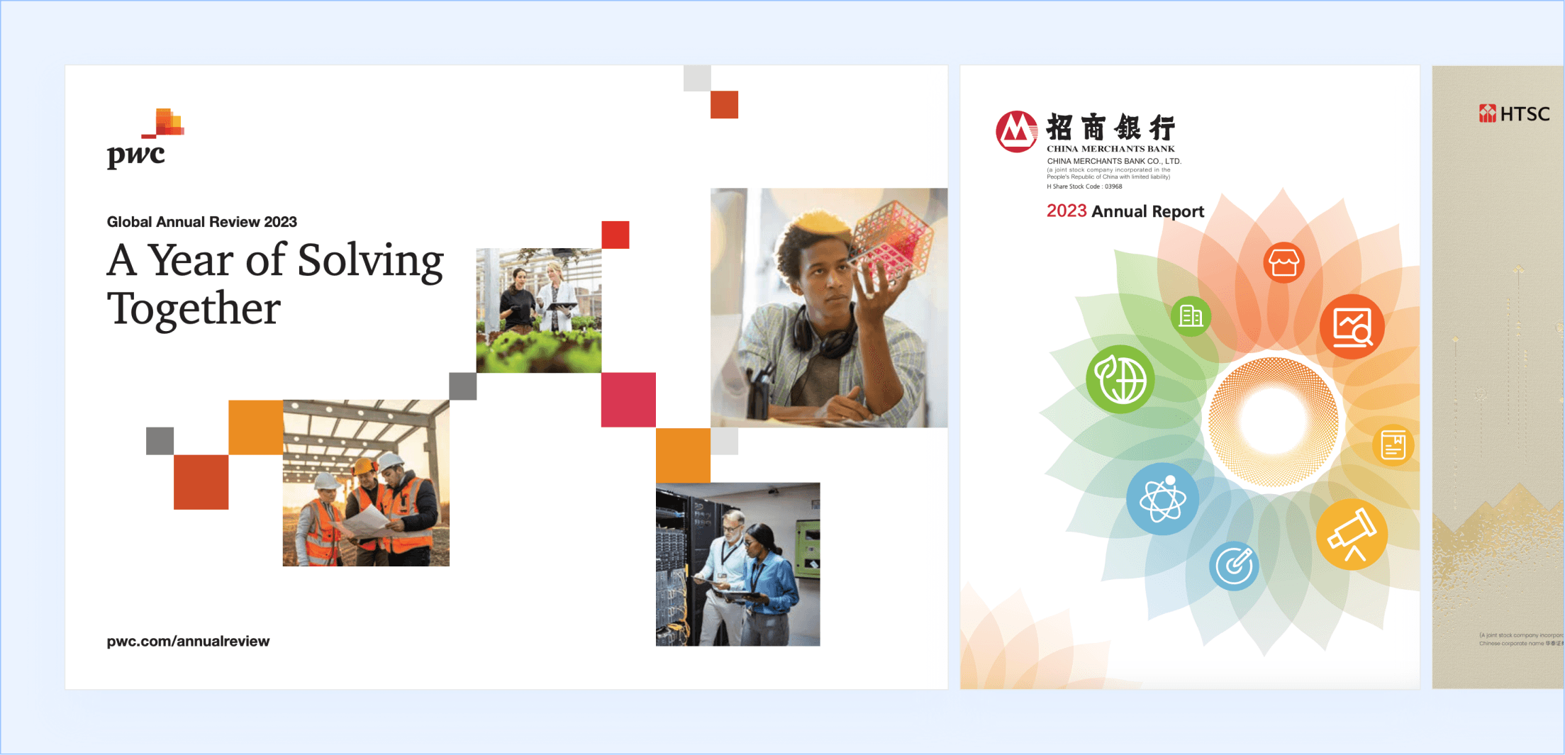
Financial analysts spend exhaustive amounts of time to find and replace data for pre-formatted documents like annual reports.
Analysts at financial institutions, which include consulting companies, investment banks, and equity firms manually re-key numbers from spreadsheets into financial document templates. It’s a process that’s slow, repetitive, and one typo away from a compliance problem.
I played a key role in Numaira getting a pre-seed round of $100,000 HKD (~$13K USD).
The founders got Numaira into Cyberport’s Macro Fund, a 6-month program from a Hong Kong-based startup incubator. We advanced through multiple rounds to secure funding. Two weeks before the final pitch, which occurs at the program’s three month mark, the product direction shifted, compressing an already tight timeline.
Realizing the stakes, I provided a prototype with technical annotations paired with an easy to implement design system, speeding up development time. As such, there was enough runway to finish an MVP and polish the front-end before the founders presented, giving the team the best foot forward and securing funding.
In the months after, I continued iterating, cutting the user’s workflow from four steps down to two, making it even simpler for users to automate their work.

From the beginning now…
The founders saw an opportunity to create a solution to a headache they’ve faced repeatedly, but as an outsider, I wanted more proof.
During their business pitch to get me onboard, they told me about their experience with the problem. But has it happened to others? As someone who has not participated in the process of financial report writing, I wanted more confirmation the problem existed. I passed several questions to the founders who were well connected with people in similar roles as themselves. In total, the founders had conversations with 12 analysts, some of which had notes recorded while others were done in passing and the founders forwarded a recap to me afterwards.
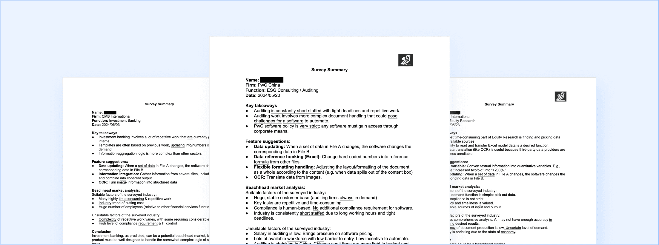
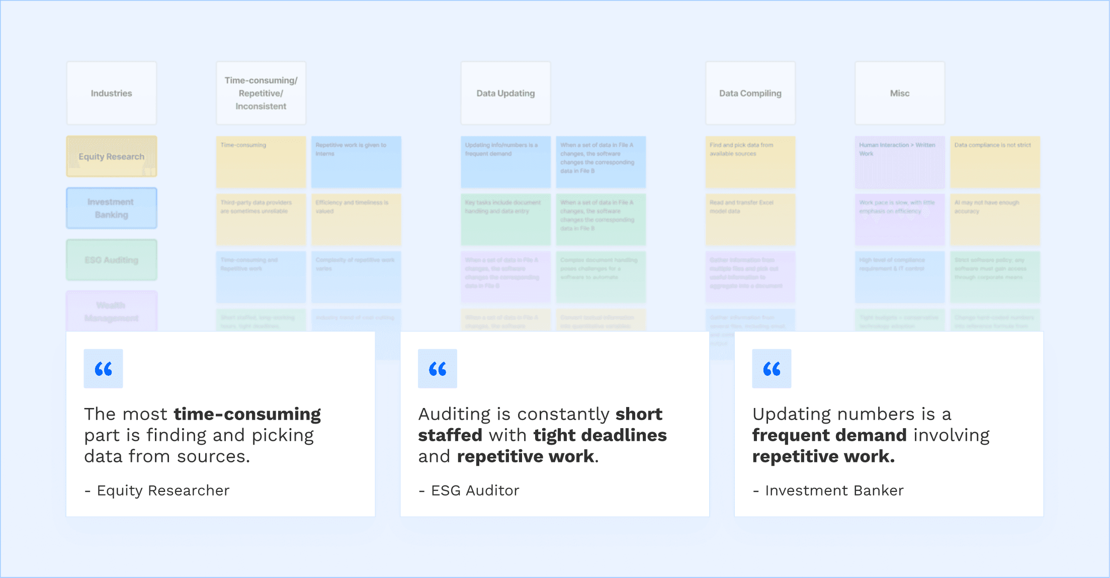
I grouped the findings into categories supported by key quotes the analysts gave.
I’ve validated that Analysts handle data updating and compiling, manual tasks which are time-consuming, repetitive, and prone to inconsistencies.
After considering the findings, my team and I honed in on 2 must-haves for the solution: data updating and multi-file search.
With ~10 weeks to build a functional MVP for the program pitch to investors, the team and I decided to focus on data updating as it was widely requested by analysts. The feature was also an intuitive step towards our vision of having a smart template that updates everything (both numerical and textual) based on new inputs.
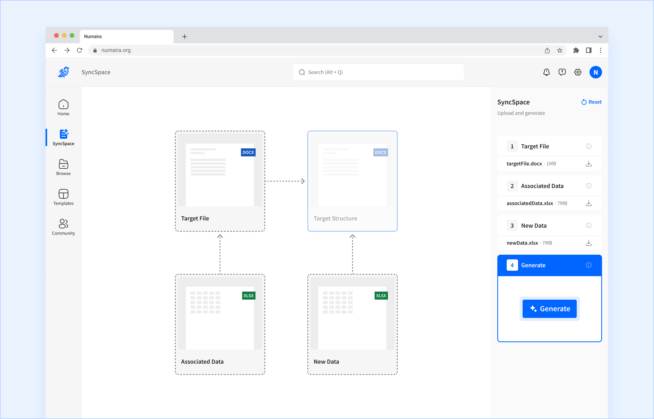
Users upload a document, its original data source, and a new data source, and the program updates every number in the document to match the new data.
Allows the user to ask for information from multiple files. The user suggests a range of files and asks the program to find specific information accordingly.
The initial workflow required team-provided document templates.
The original concept saw the MVP supporting templates provided by the user. This would be the most ideal as it may make our solution relatable to more people who test it, building our first users list. Yet, upon initial examination, we couldn’t get any AI models to reliably populate data from source file (.xlsx) to user-defined templates (.docs).
Given this was an MVP, the team and I needed to get our foot in the door so we could start testing. If this means demoting the scope down to a fixed team-provided financial document template for demo purposes, then that’s valid. If we had more time, we could then work towards user-defined template support.
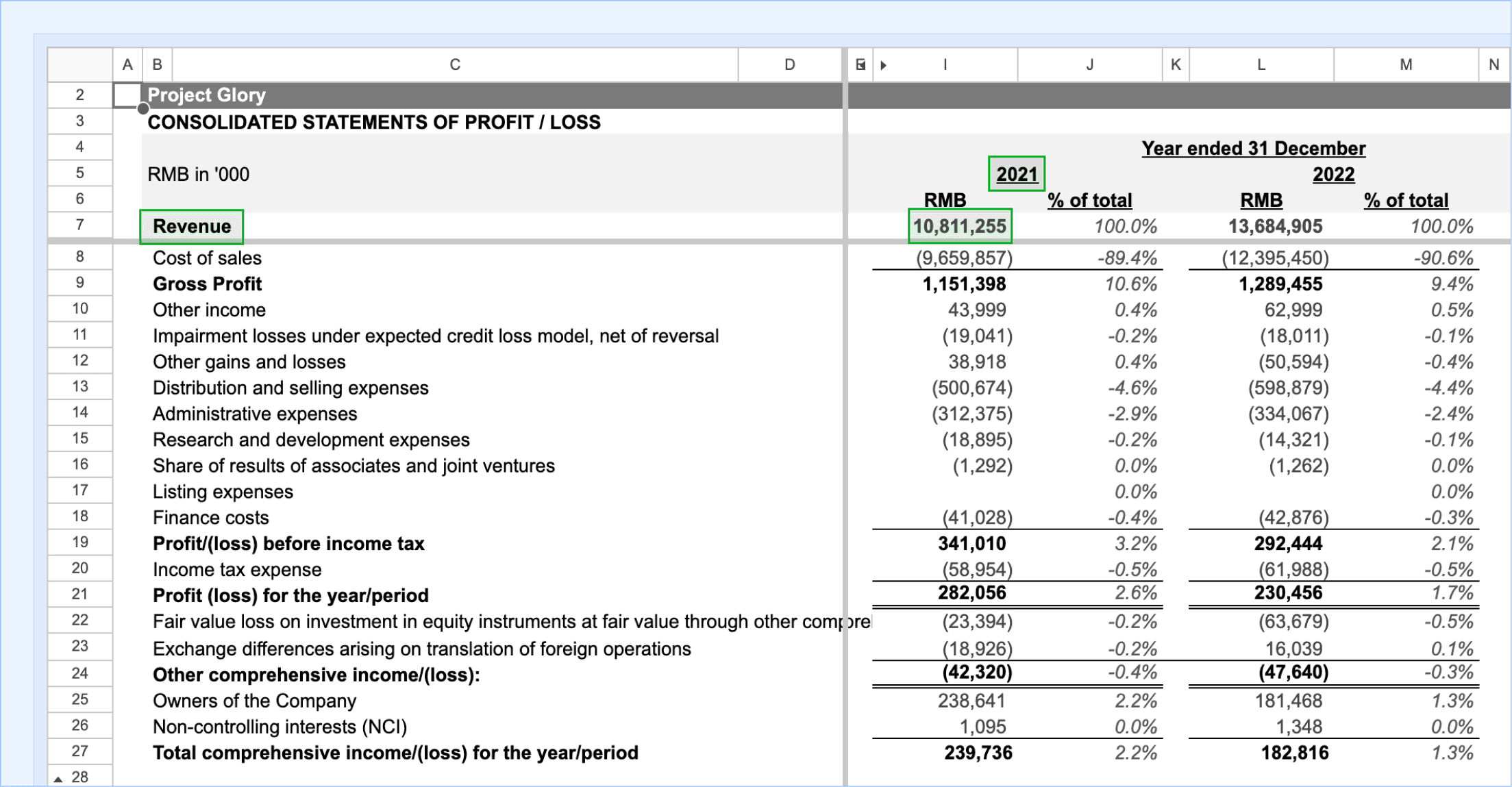
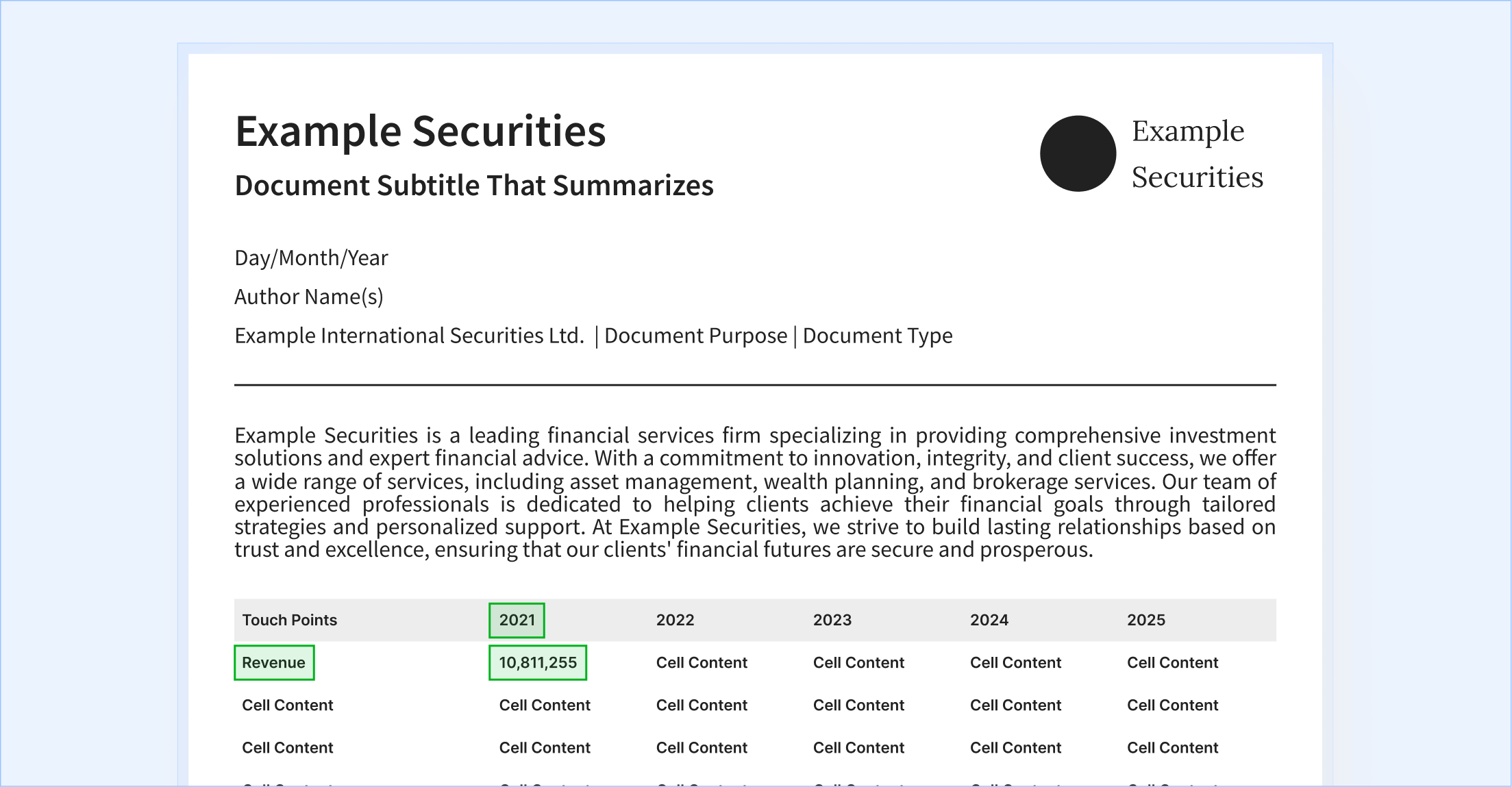
Then, there was a breakthrough: there was a way to enable user-defined templates.
After weeks of designing the team-provided template workflow, going through iterations, laying out a design system, and even starting the second must-have feature, it all came to a stand still one day.
Our engineers were able to get AI to create a template from a source file (.xlsx) to user-defined templates (.docs), the exact obstacle that forced us away from user-defined templates in the first place! This was big news because it meant we could jump straight to allowing businesses to use their own financial document layouts, paving the way for broader adoption from the beginning.
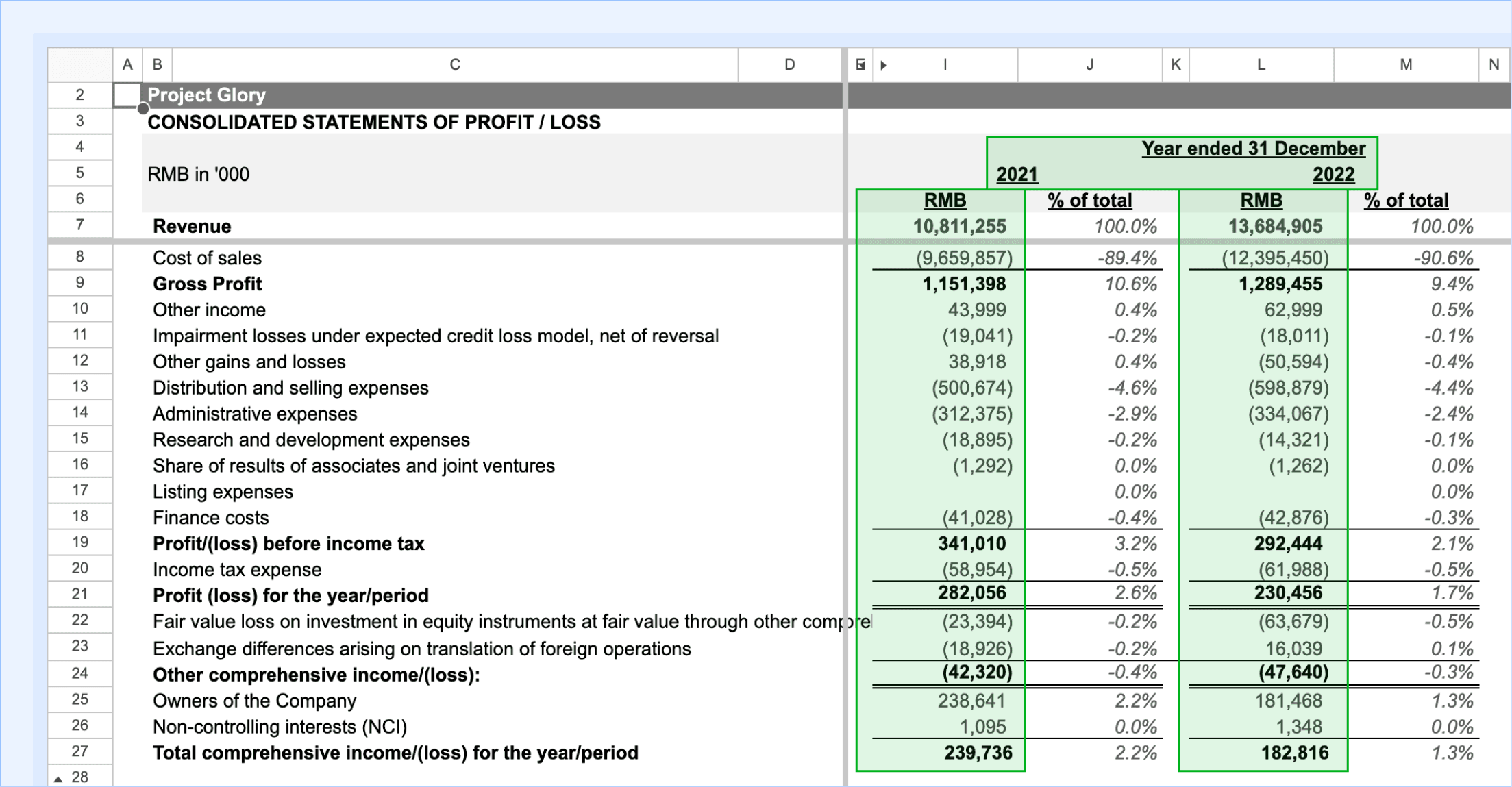
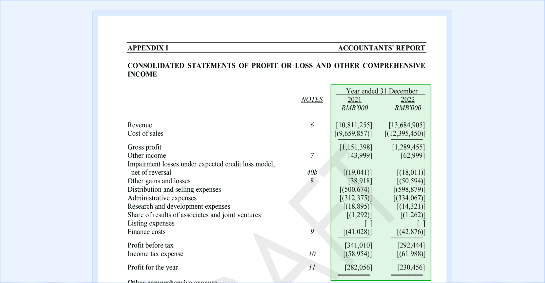
With time running out, the team and I had to consider the trade-offs carefully.
Given this was an MVP, it was acceptable for us to stick with the original workflow as we were already starting the front-end implementation stage (the back-end was done). Also, there were only two weeks until the final presentation pitch.
Pivoting to the new workflow would mean adding complexity to the workflow as there are now more files to upload. The back-end needed to be rewired and the design would need to be scrapped and reworked while still enforcing intuitiveness. The odds were stacked against moving to the new workflow. Yet, the team and I pushed for the new workflow as it would give us the best foot forward in the program. If this challenging path gives us a higher chance of securing funding then it’s the right way to go.
With these stakes, I advocated shelving the second must-have feature, as it wasn’t realistic in our timeframe.
Having a design system and general visual language for the UI meant that even though the previous userflow was scrapped, I didn’t actually start from square one. I was able to focus on the experience.
Users upload a document, its original data source, and a new data source, and the program updates every number in the document to match the new data.
Allows the user to ask for information from multiple files. The user suggests a range of files and asks the program to find specific information accordingly.
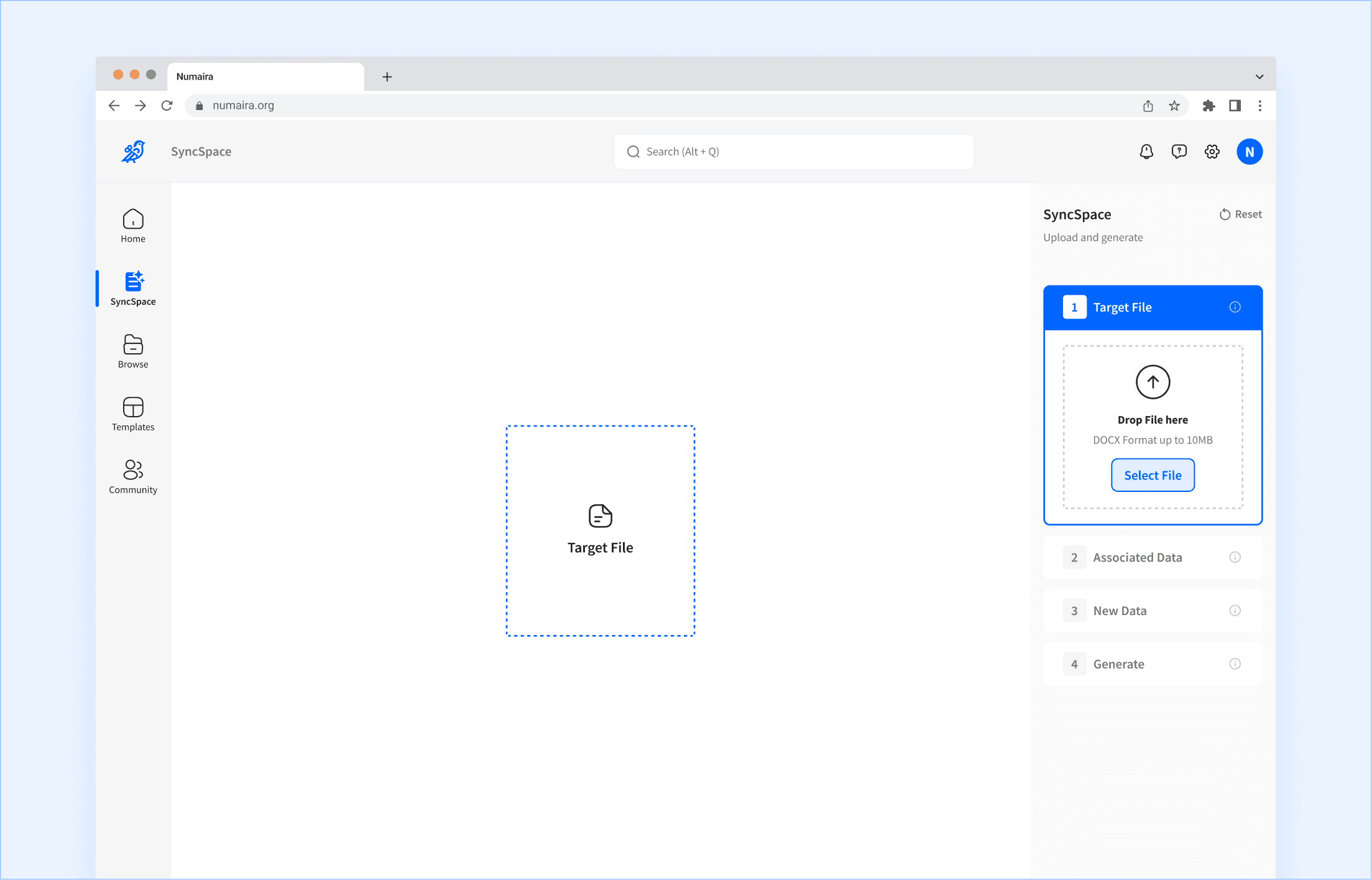
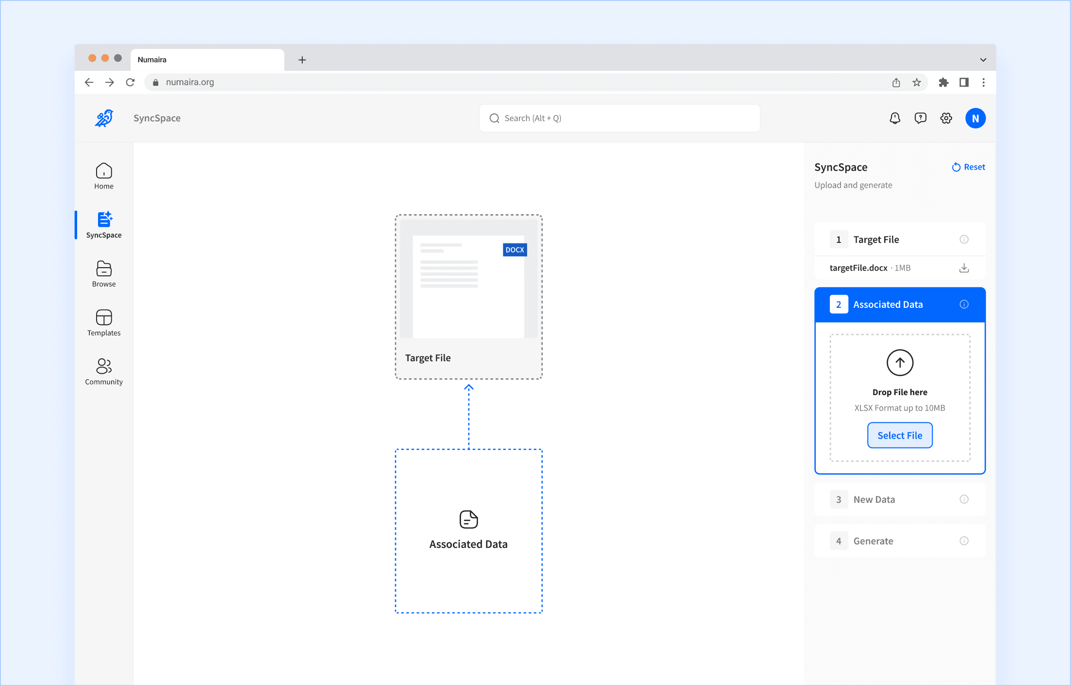
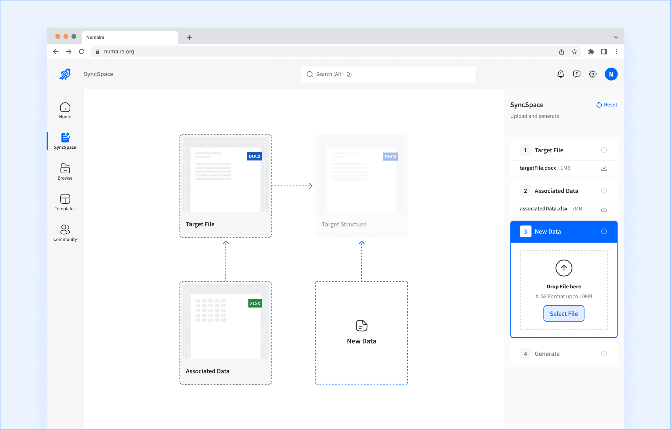
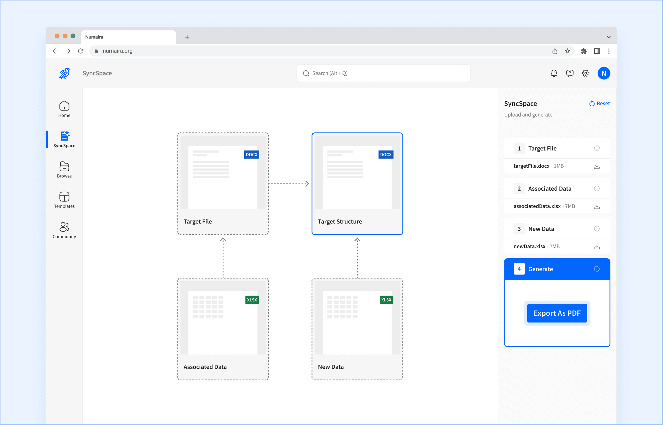
32 high-fidelity screens boil down to a visual map that intuitively illustrates the purpose of each file to upload, automating data entry.
Analysts upload one file at a time. Doing so makes cards and arrows appear, letting them know why those files are needed and how they relate with each other. The drawer on the right is where the actions take place. The center file map is a dynamic, non-interactable visual.
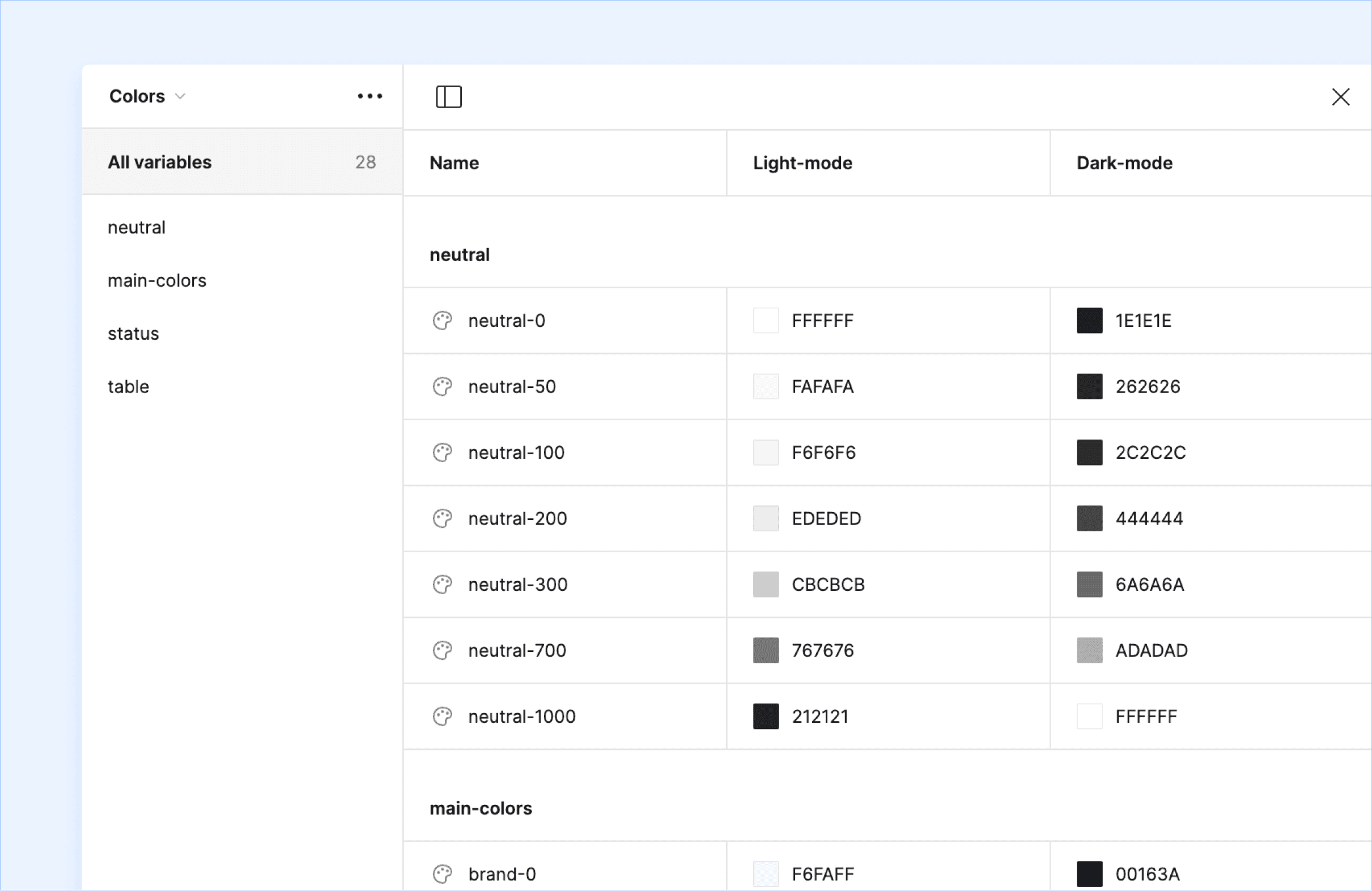
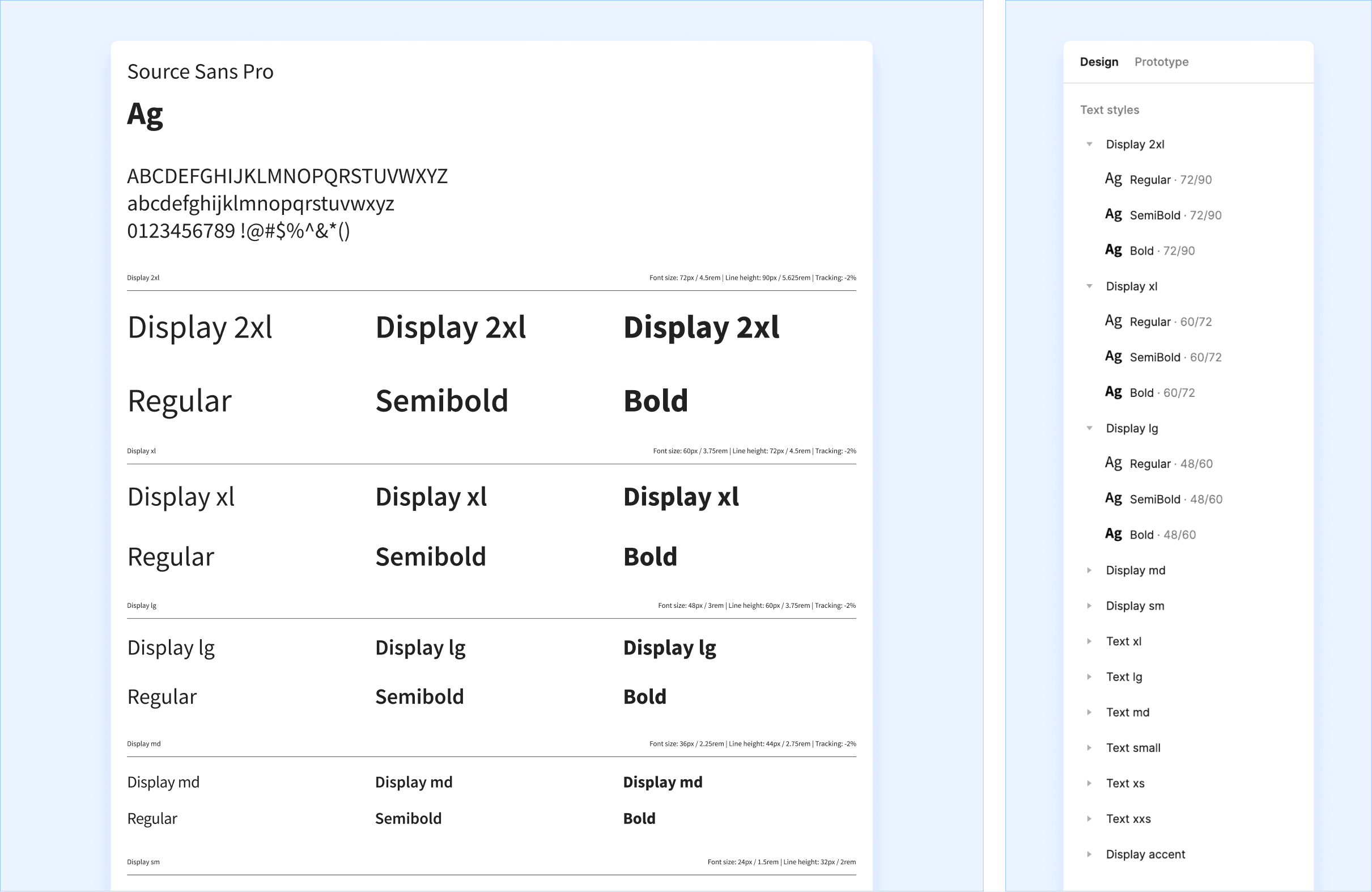
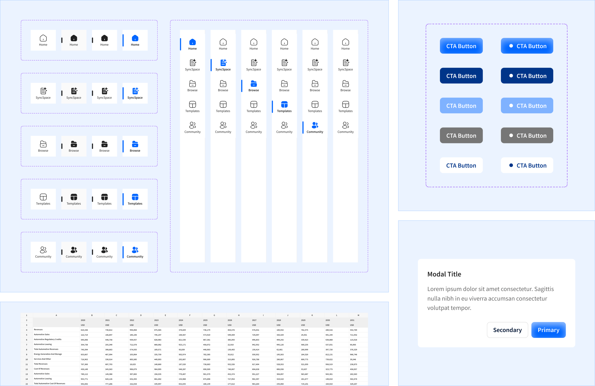
I focused on the core components. Enough for engineers to have consistency during a time of volatility and change.
With the speed of the workflow changes, there were constant iterations. A design system must be flexible and fast to use. I came up with a bare-bones color system made up of primitives (hexcodes) and semantics (color usage guidelines). I kept the component library to common elements like buttons and inputs rather than large specialized items that make an appearance only once or twice. In total, no more than 20 types of components. Those decisions made it low maintenance, enabling the engineers and I to focus on building the experience.
Post-competition, the product faced technical limitations from AI and feedback from target users.
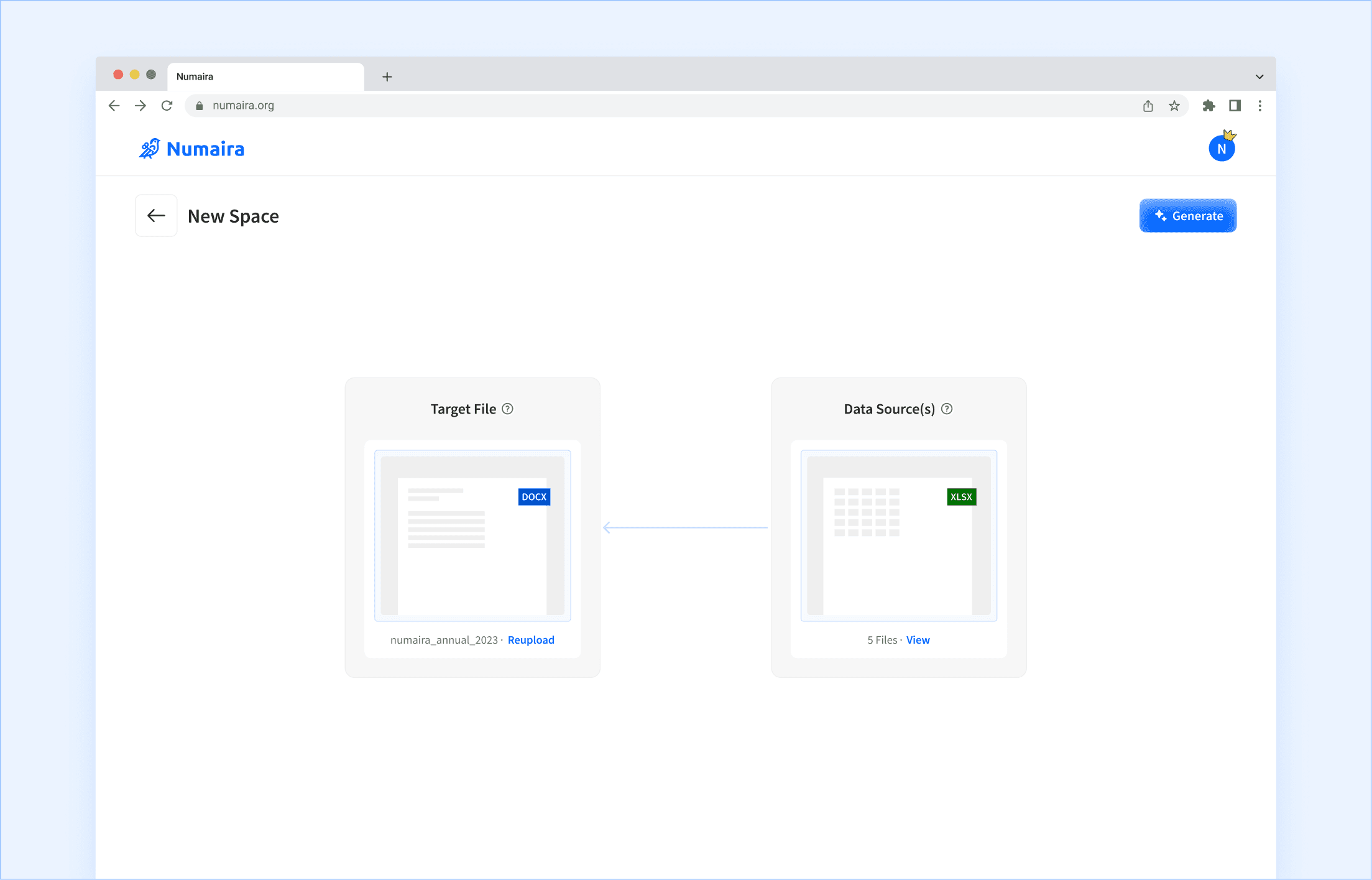
When the pre-seed fund hit the startup’s checkbooks, the team conducted more testing and experimentation. They found out it was possible to forgo the associated data files entirely. It was now two things: the target file (desired output) and the new data sources (the numbers the analyst wants to replace). This works because we can determine how those numbers in the target file are being used and make the matching pairs right then and there.
Complexity is introduced during the file uploading
The 4 modules that appear during each step make the experience more complicated than it actually is. When modules appear on the right drawer and visual map changes, those two motions fight for attention. Either I get rid of the module displays entirely or go for a more static approach. I went with the latter. Now, it’s two steps where I can show both inputs at the same time, allowing users to upload in either order.
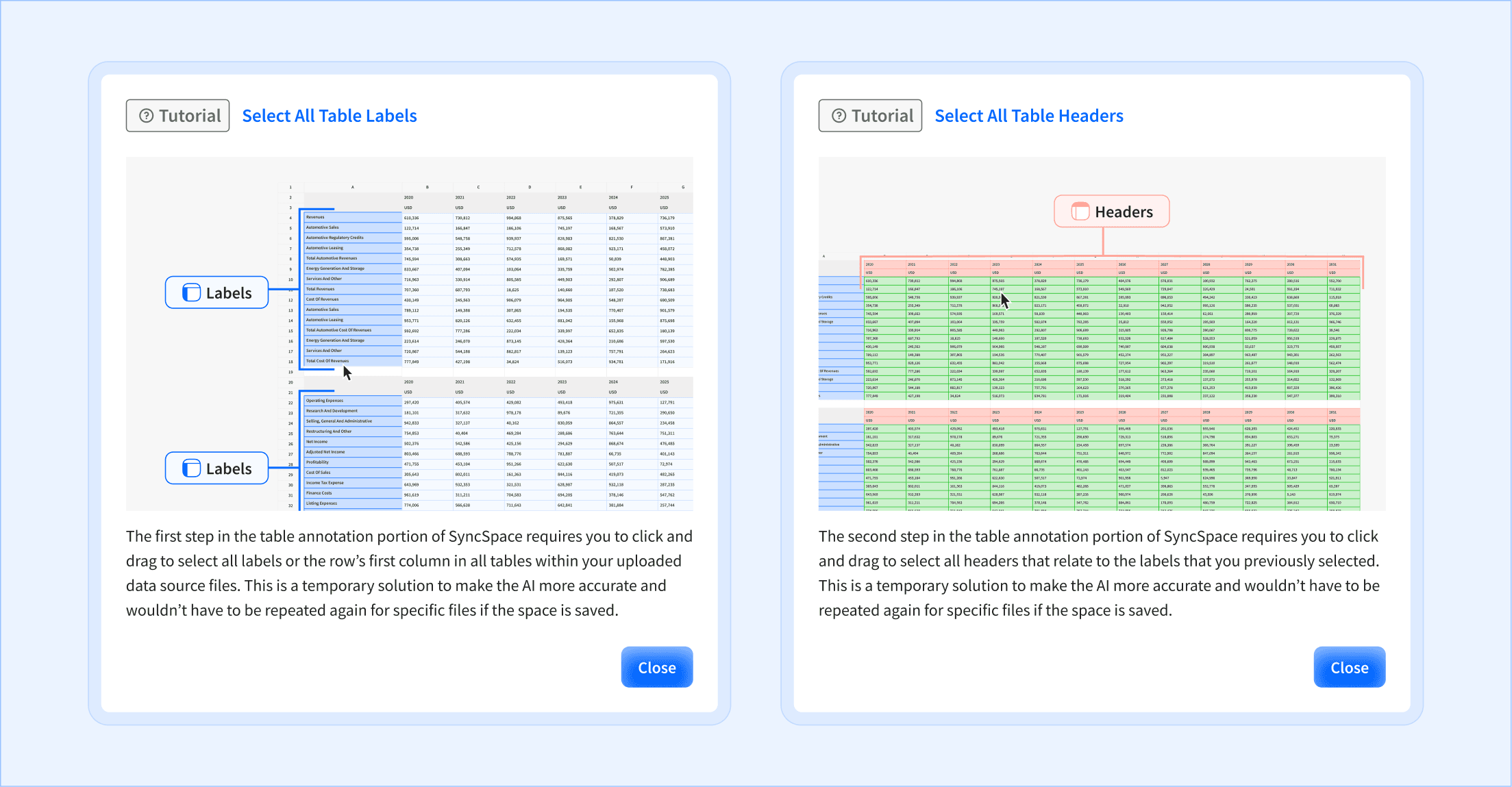
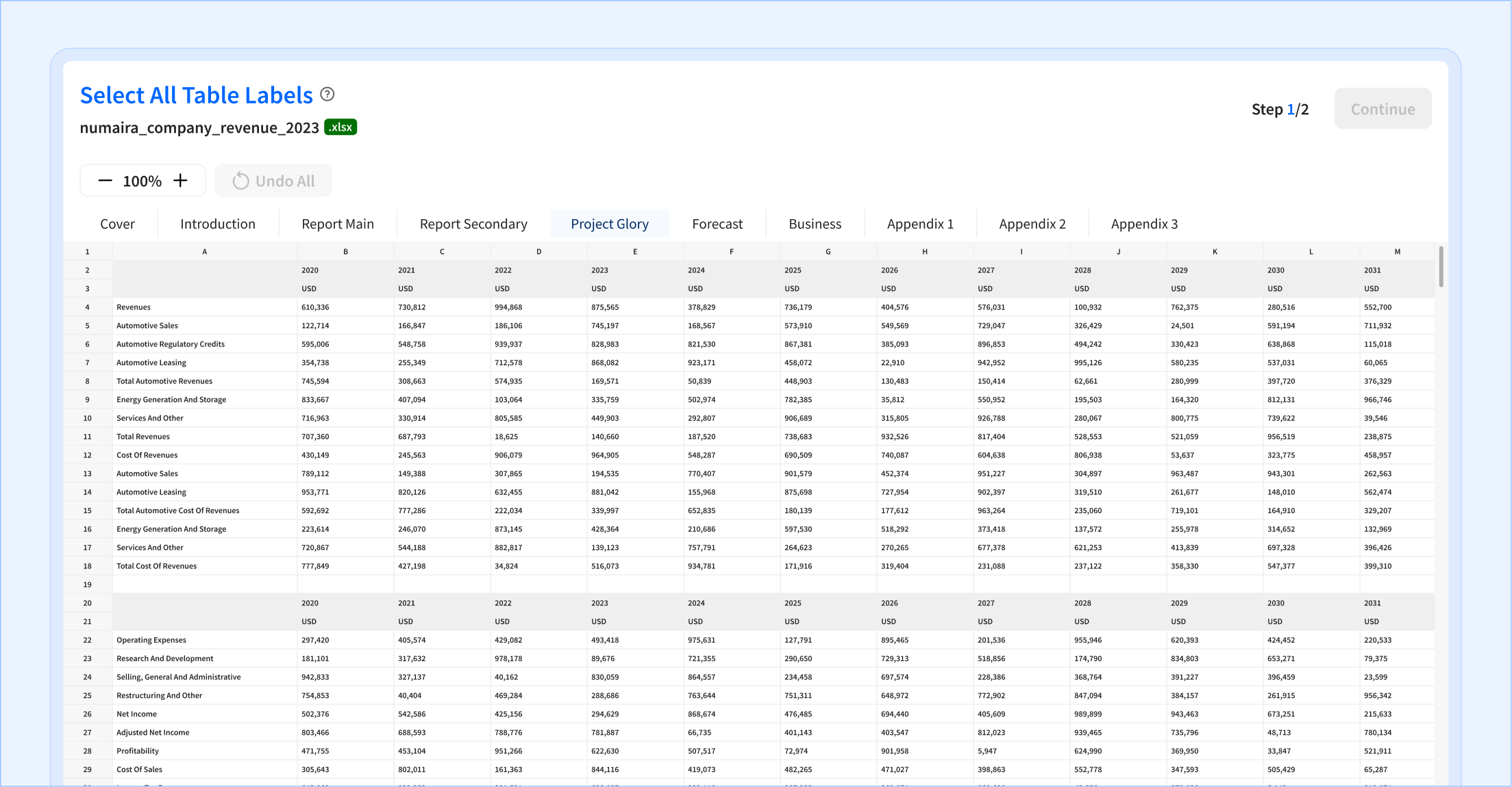
AI struggled with distinguishing table headers and rows.
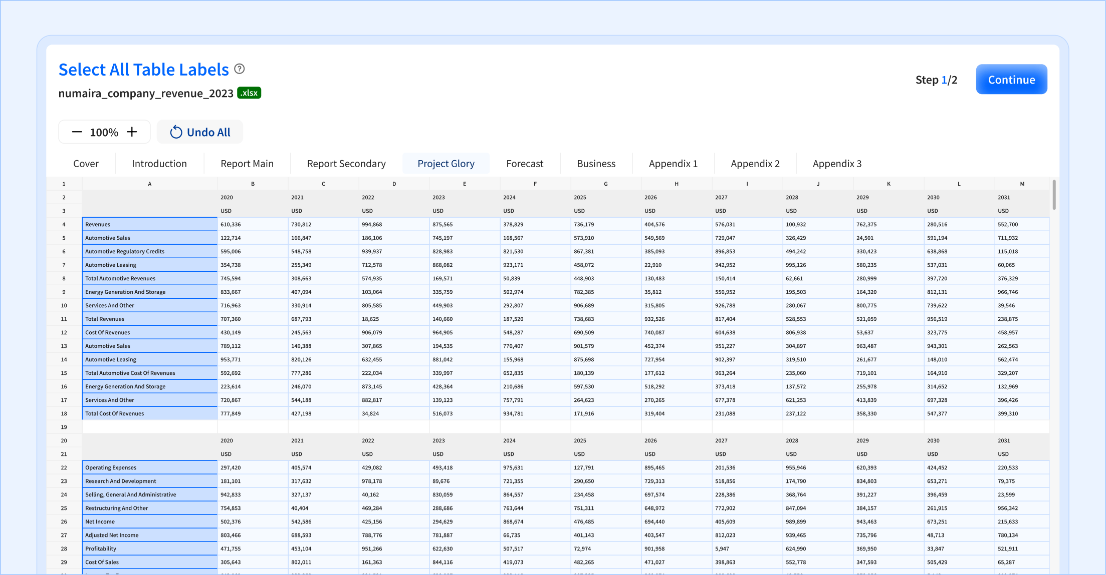
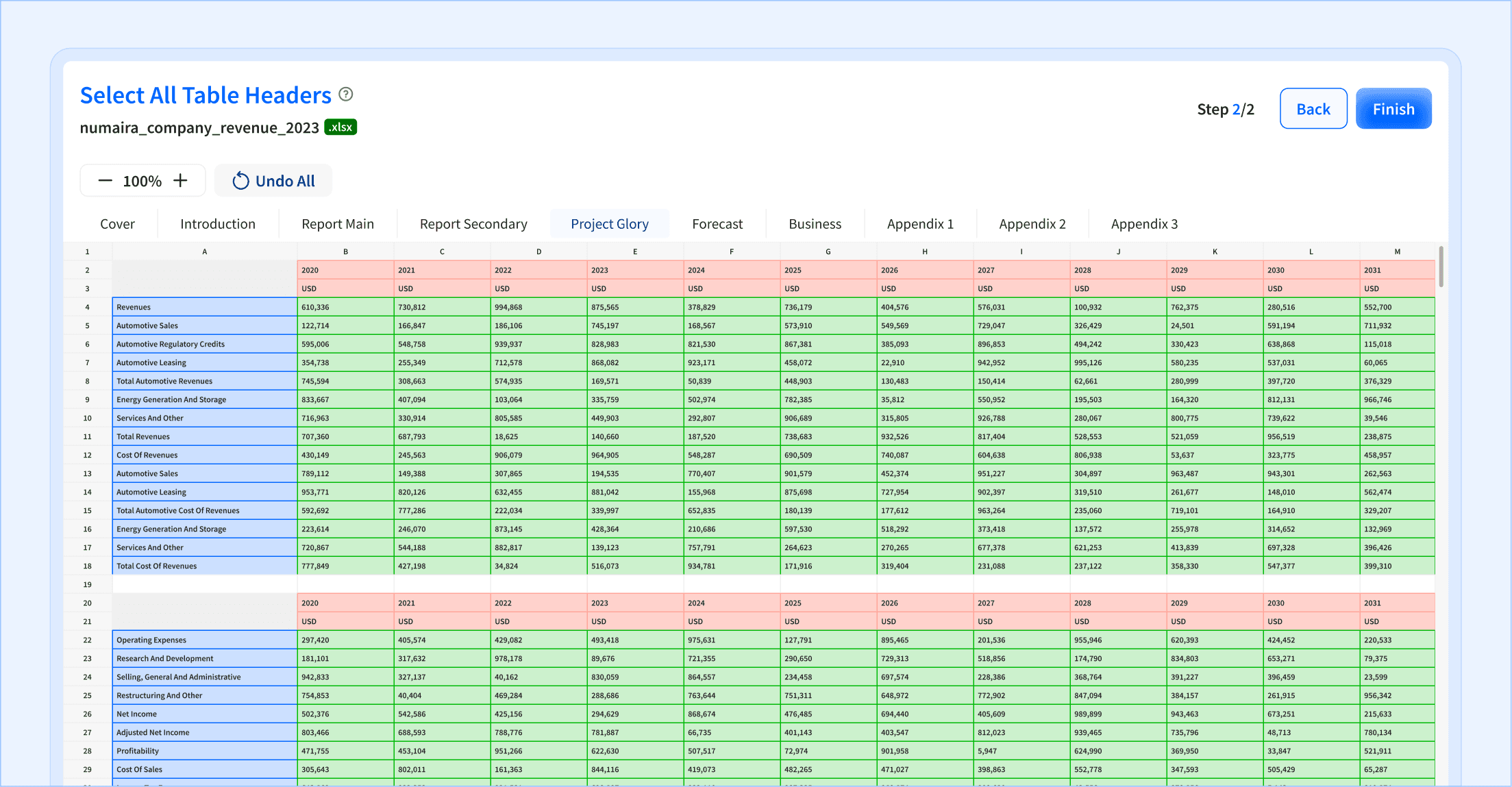
The solution the engineering team came up with was to offload annotating the data to users. At first, I was hesitant because I knew this was repetitive and tedious in and of itself no matter what UX measures I decide to put in to smooth it over. At face value, it seemed counter-productive to what we were trying to achieve: automate financial documents. But there was no way around it and the silver lining was that users would only need to do it one time for any desired output format.
My job then was to make this portion of the userflow as easy as possible. “Drag to select” interactions and a familiar Excel layout was the best combination. I also added guide dialogs to appear during the user’s first time in the userflow and accessible via the question mark icons.
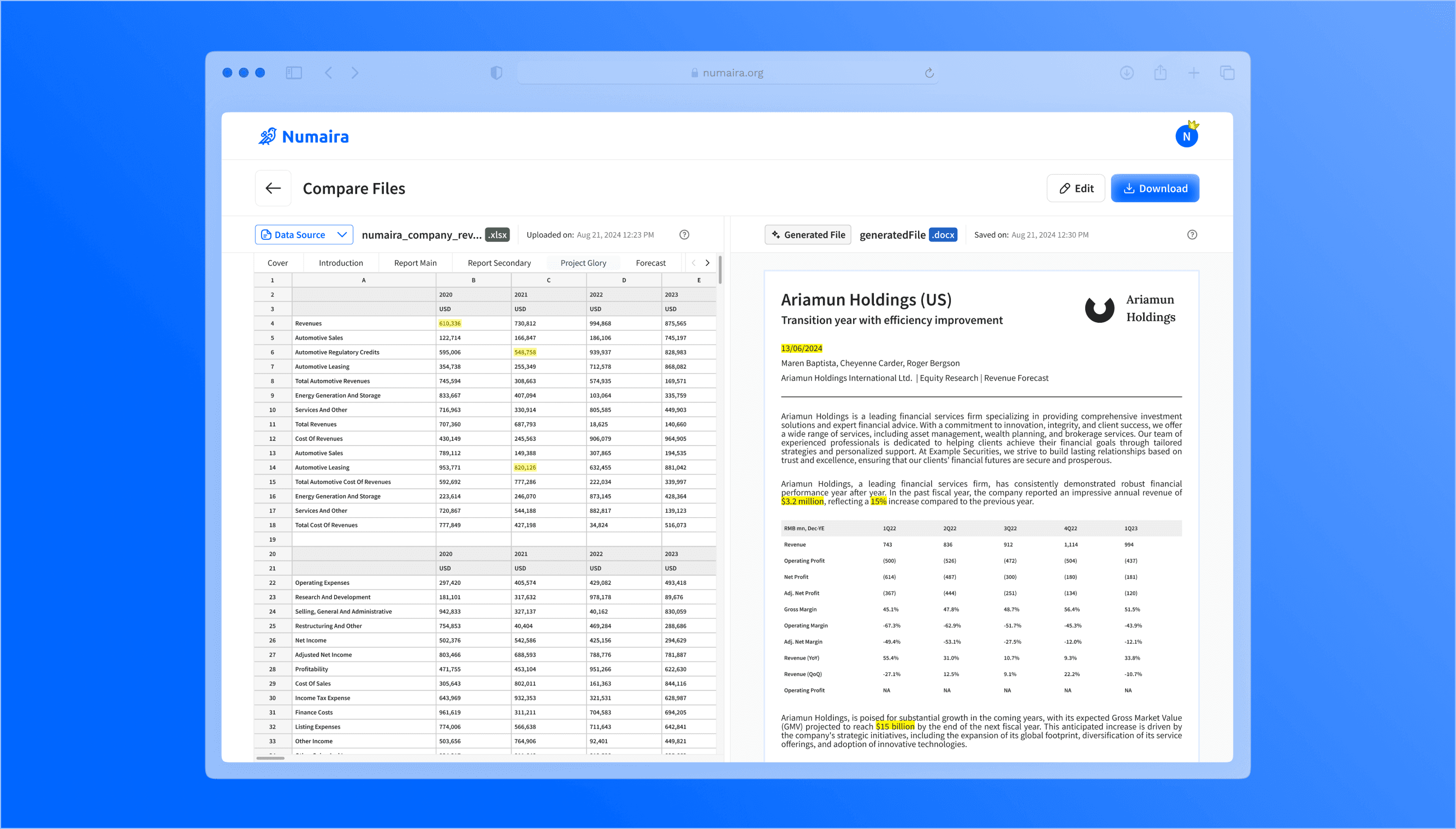
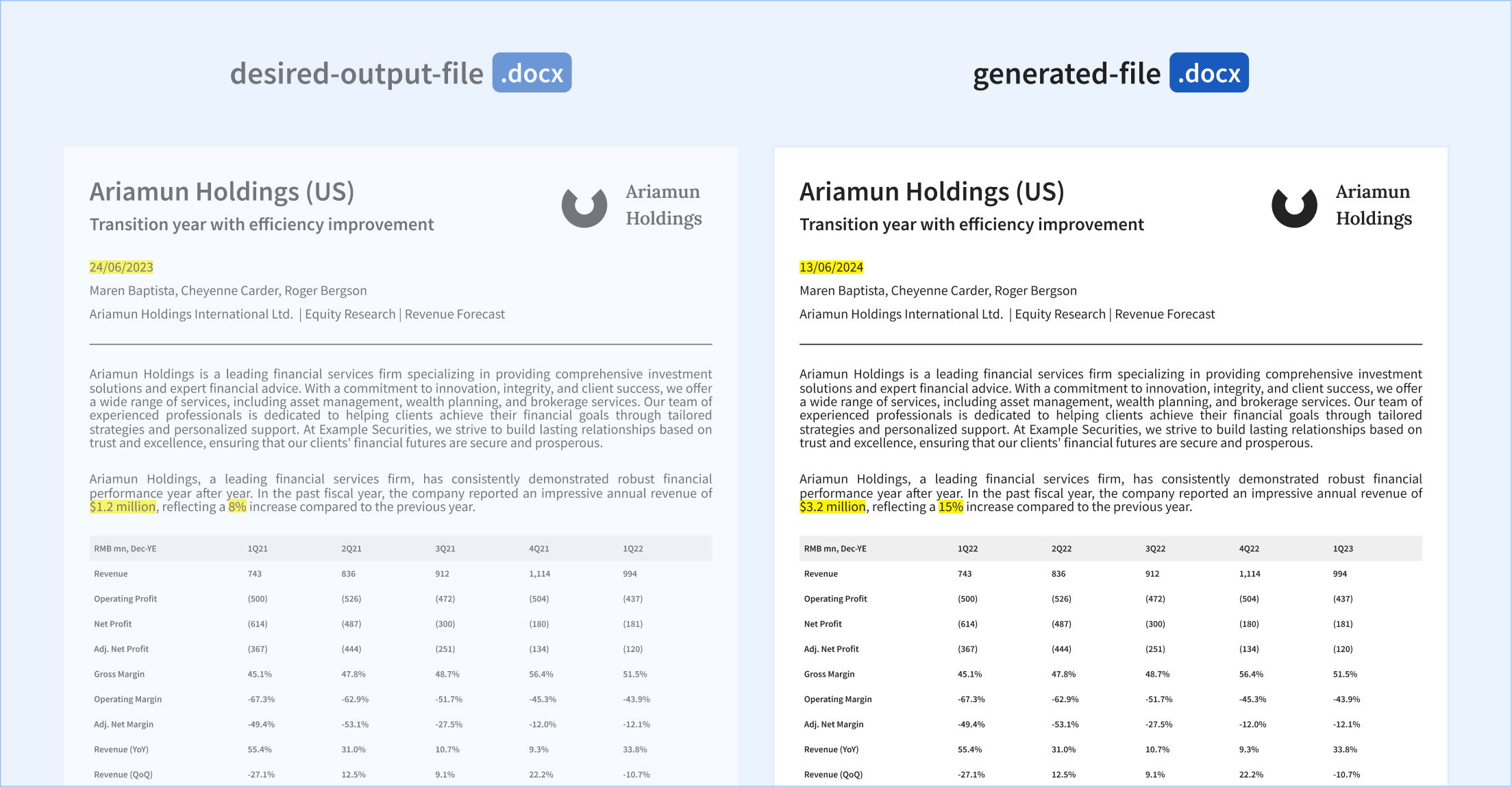
Target users wanted to get a preview of their document with changes shown first before exporting.
I added a side-by-side comparison between the desired output document and the resulting new document with the data from the user-uploaded data sources. Data points are highlighted to show how the data changed.
The full userflow is now more focused and simpler than ever before, thanks to user feedback.
The team’s decision to commit to the current feature rather than spreading attention to less impactful functionalities, enabled me to remove the sidebar from view. With the new approach to how the AI reads data, I was able to make further reductions, paving the way for a straight-forward experience.
Simplicity is king but sometimes it takes time to see it.
Often, it’s easier to create complex solutions than to make simple ones. For me, Numaira’s first approach was a prime example. Visualizing workflows on paper is impressive and even won the favor of the judges at the program. But another iteration proved the solution was overly complex for what it actually does: upload files and get an output. There was a middle ground and I only found it after other influences pushed the design to change.
AI developments and limitations influence user experience, so staying informed and knowing the product makes a difference.
Throughout the project, the workflow changed a lot. It started with assuming the capabilities of AI at reading uploaded data (data extraction and associating types of information) and the scope of what AI is capable of went up and down as the team faced consistency issues and surprises. All of which influenced the design of the app.
Where the project stands
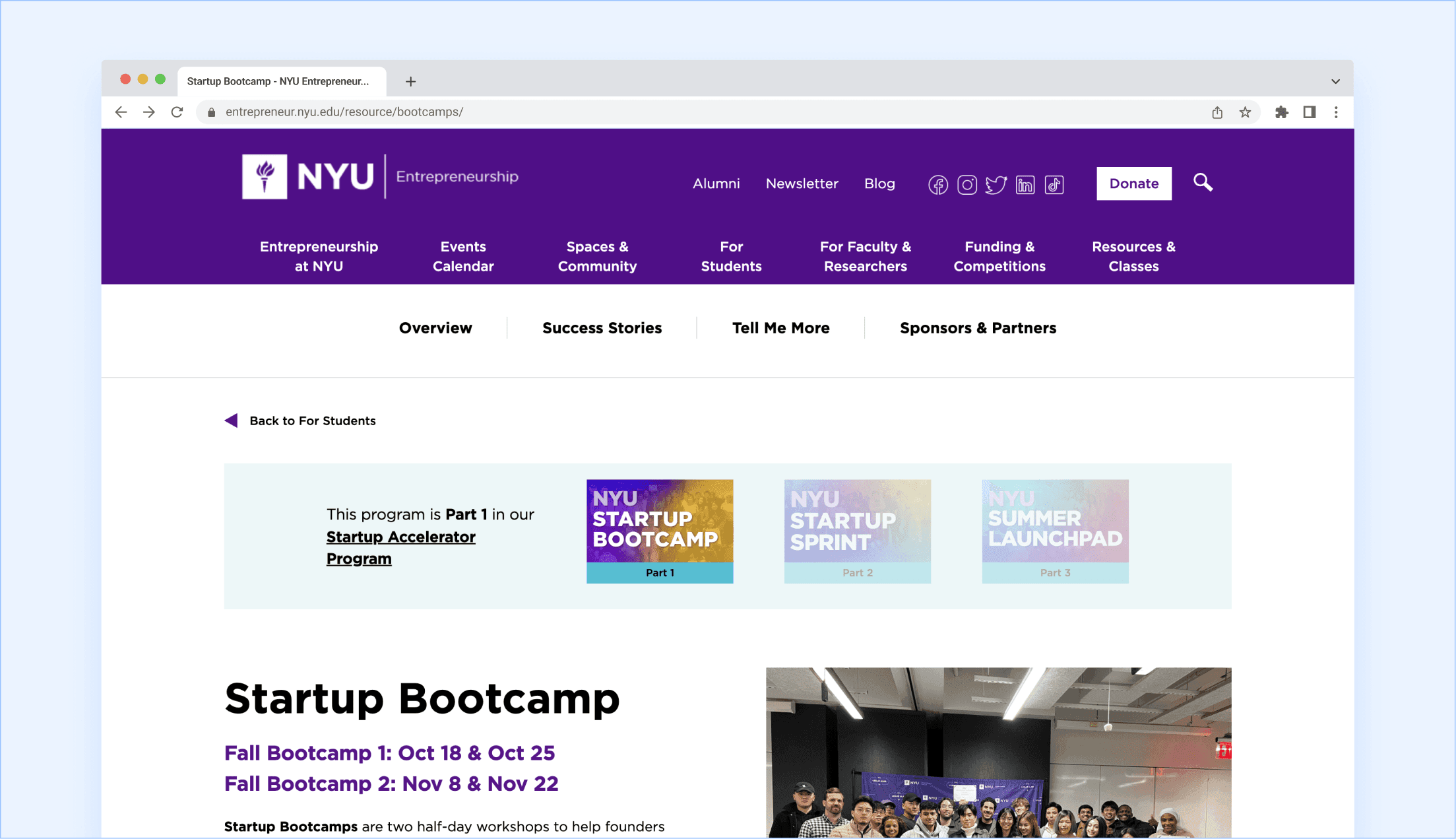
The last program Numaira participated in was New York University’s Startup Bootcamp in November 2024. After which, I parted ways with the company for a new role as the team began building the iterated design, so I can’t speak to the product’s technical outcomes firsthand. I later learned the team chose to pause Numaira to focus resources on other products, a reminder that even validated, funded ideas depend on sustained team capacity, not just research and design. With how fast AI has been moving, I wouldn’t be surprised if the many limitations my team and I faced have become non-existent.
My teammates had nice words to say about me!
I've had the pleasure of collaborating with Eddy on multiple projects. I can confidently say he's one of the most reliable and skilled professionals I've worked with in UI/UX design and front-end development. His design work is consistently top-notch, balancing creativity and user-centered focus, and he always delivers on time, no matter the project's complexity.
Eddy brings an intuitive sense to UI/UX, often preempting user needs and making thoughtful design choices that elevate the overall experience. His ability to translate complex requirements into clean, engaging interfaces speaks to his depth of expertise and dedication to his craft.
On top of that, Eddy’s proficiency in front-end development means I can always rely on him to handle some parts of UI implementation. In fast-paced, high-pressure situations, he remains calm and efficient, often taking the initiative to ensure every detail is flawless. His work ethic, combined with his technical abilities, brings an assurance that any project he touches will be completed with excellence.
Whether it's managing design or executing front-end code, Eddy has consistently gone above and beyond, making him an invaluable asset to any team. I highly recommend him to anyone looking for a top-tier designer and developer.

Full-stack Engineer
@ Numaira
See what other people are saying about me here.